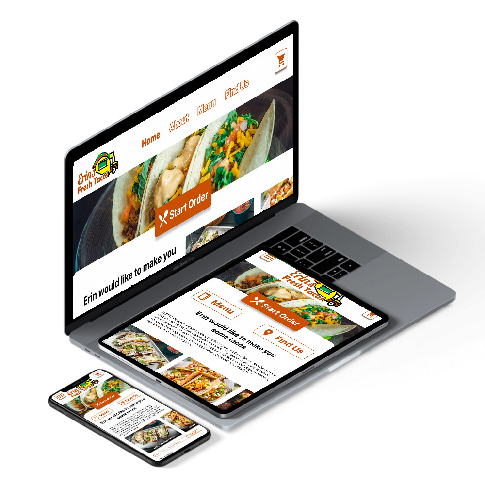
Responsive food truck ordering website
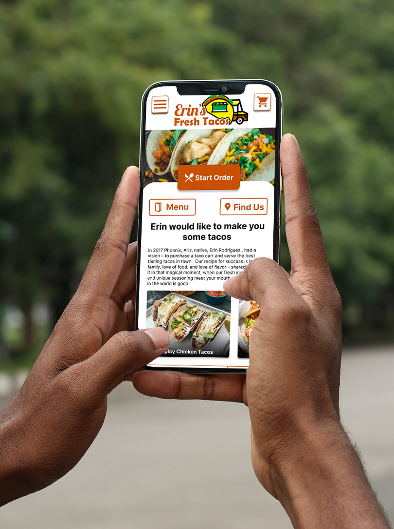
Erin’s Fresh Tacos is a responsive website for a food truck. I wanted to create a flexible web experience that would make it easy for the user to online order and include the convenience of choosing a time and food truck stop to pick up their order.
By focusing on making the ordering process better for users, doing so would make the user happy and increase engagement. It also addressed the business’s interest in increasing the amount of orders they could take in, thus allowing users to schedule their order gives the stakeholder time to prep ingredients ahead of time so the food truck wouldn’t be overwhelmed.
To see an overall look at the project here is the slide deck.
Project Overview
My Role:
I lead the UX work and produced all major deliverables.
Responsibilities:
User research, ideation, UX design, wireframing, prototyping, visual design, branding, product design
Process:
I used the design thinking process in the development of this website:
User Research, Define, Ideation, Prototype, Test, and Implement
Problems and Goals
In this project, I was confronted with the task of designing an all-in-one solution that would allow for users to order from the food truck on mobile, tablet, and desktop. I wanted to focus on an easy and efficient online ordering experience for the food truck customers and the ability to schedule when/where to pick up their order along the food truck stops.
The Problems:
- Customers are not happy about having to wait in line for their order. Many of them would prefer to order online and schedule when to pick it.
- The owner of the business feels like there is a drop off of engagement with their ordering system just being on desktop.
- The owner frequently gets calls on where the food truck is and what are the stops at any given moment. Those several minute conversations add up throughout the day and leads to productivity loss.
The Goals:
- Better serve customers by allowing them to have it scheduled for a particular place and time for pickup so they don’t have to wait.
- Increase engagement with users with a online ordering system allow customers to easily order online using a responsive website so they can order with many different devices. This will allow the food truck to increase their sales by giving them the ability to take more orders.
- Decrease the amount the call the owner has to answer by allow customers to easily look up the live location of the food truck and future stops on the website.
User Research
Introduction:
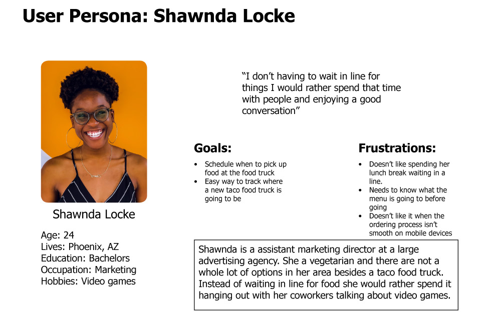
I did a competitor analysis, storyboards, user personas, user experience maps, and a user flow for my user research. I started my research with a competitor analysis and not only did I look at food truck websites but also national restaurant chains to see how they do the schedule and ordering process. After that I went into user personas and user experience maps to really get a handle on who would be using the website to order and how they would order.
I found that when I combined the insights gained from both the competitor research and user personas I realized that the user is someone who is busy and wants to get through the ordering process as quickly as possible on whatever device they had on hand at the moment. So I decided it would be beneficial to build a responsive website with a mobile first approach that gave users a flexible way to answer.
Later in the process I conducted a usability study with potential users. After receiving their feedback I changed my designs to reflect a better user experience.
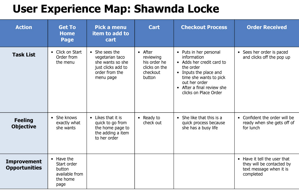
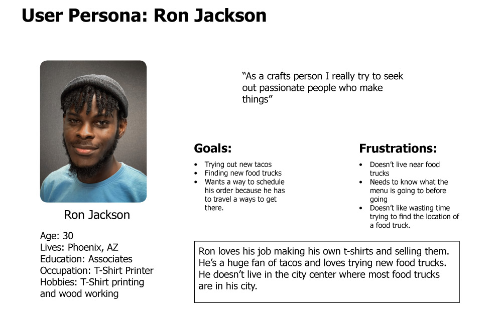
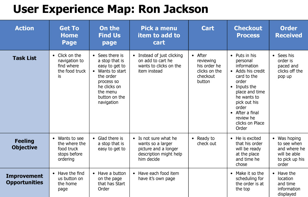
User Personas and Experience Maps:
I found that when I combined the insights gained from both the competitor research and user personas I realized that the user is someone who is busy and wants to get through the ordering process as quickly as possible on whatever device they had on hand at the moment.
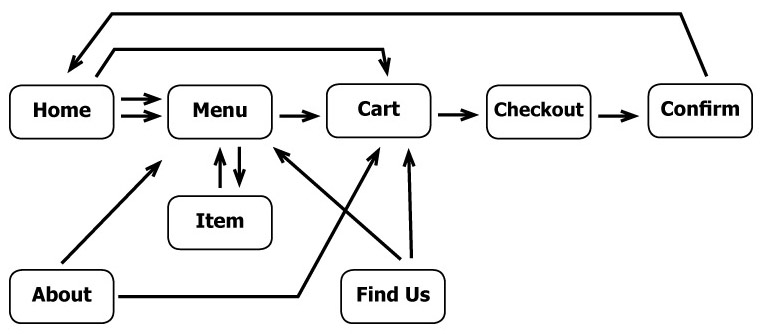
User Flow: For Checkout
The goal of this user flow is to get them to the menu to pick out their items or to the item page, to their cart, and then through the checkout process in the fewest pages possible. I put some redundancy in the flow by putting two buttons on the home page that link to the menu so users could start their order in several different ways.
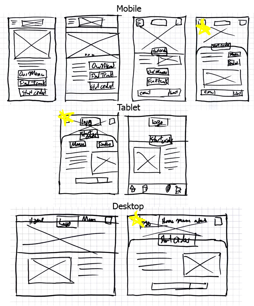
Wireframes and Low Fidelity Prototyping
Paper Wireframe
As I was creating the wireframes for this project I was focusing on a mobile first approach. My goal for the design was to create some redundancy with the buttons, so matter how users want to interact with the website it all leads them to ordering items.
Once I decided on a layout for mobile devices I carried that to the tablet and then the desktop design. When I was making the design for the tablet I liked how the Menu and Find Us buttons are so I carried that over to the mobile version for the digital wireframe.
Digital Wireframe
My goal when transitioning from the paper to the digital was to put the focus on users to start their order. When creating the home, find us, and about pages it was important to create a hierarchy encouraging users to start their order as soon as possible.
So I made sure that the Start Order stood out among the other elements on the page by making it bold and in the center
It was also important to create a flow that got users through the ordering process seamless with as few screens as possible.
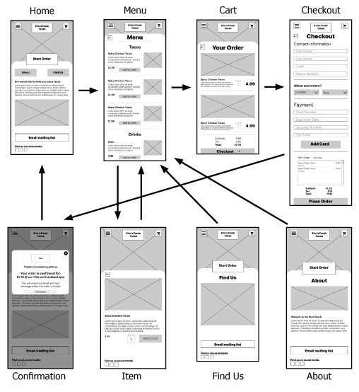
Low Fidelity Prototype
I wanted to design a flow that would get the user through the ordering process as quickly and smoothly as possible. While also making sure there were several places for them to start their order on the home page. It was also important that the three different versions felt like they were the same website.
Usability Study
User Interviews
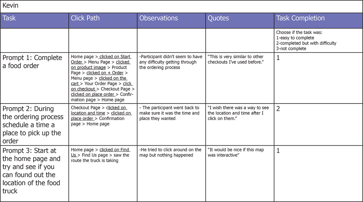
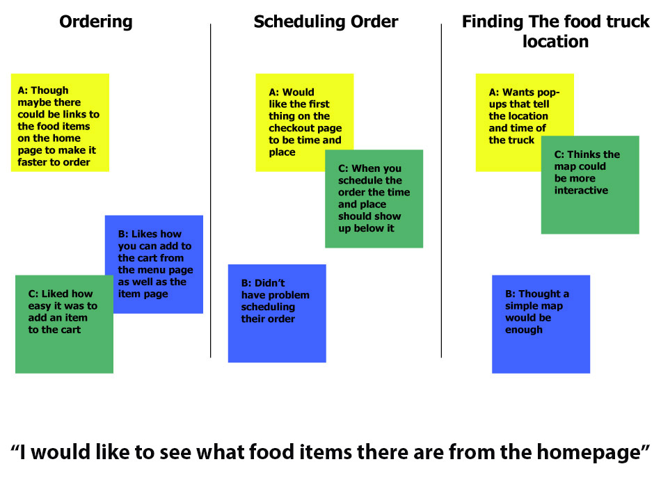
In order to better understand the goals and pain points while using the Low Fidelity Prototype, I conducted moderated interviews with my seven participants where I had them perform as set of tasks. Their ages ranged from 23-34 and included male and female participants. I assigned three simple tasks to each user: complete a food order, schedule an order, and find the location of the food truck.
Affinity diagram
Insights
Through affinity mapping, the following themes/pain points emerged:
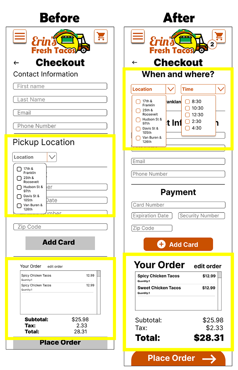
- Participants wanted the first thing on the checkout page to be where and when to schedule their order
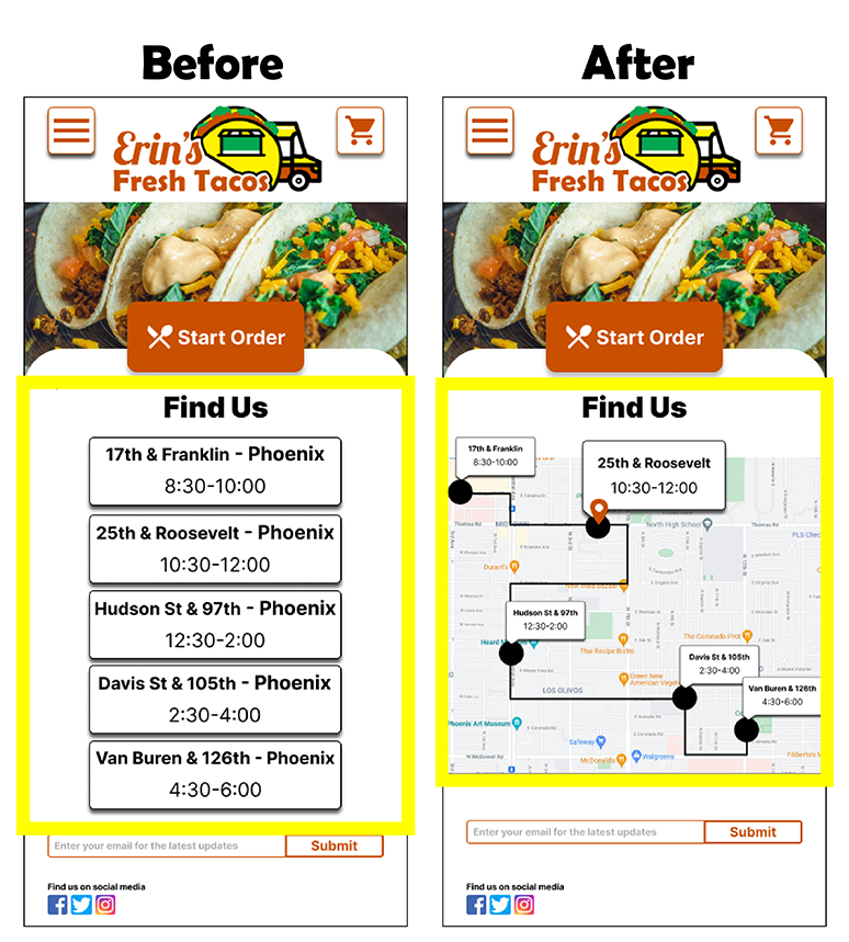
- Two of the participants wanted the map of the times and places of the food truck stops to be interactive
- Participants liked how easy it was to add items right from the menu to the cart
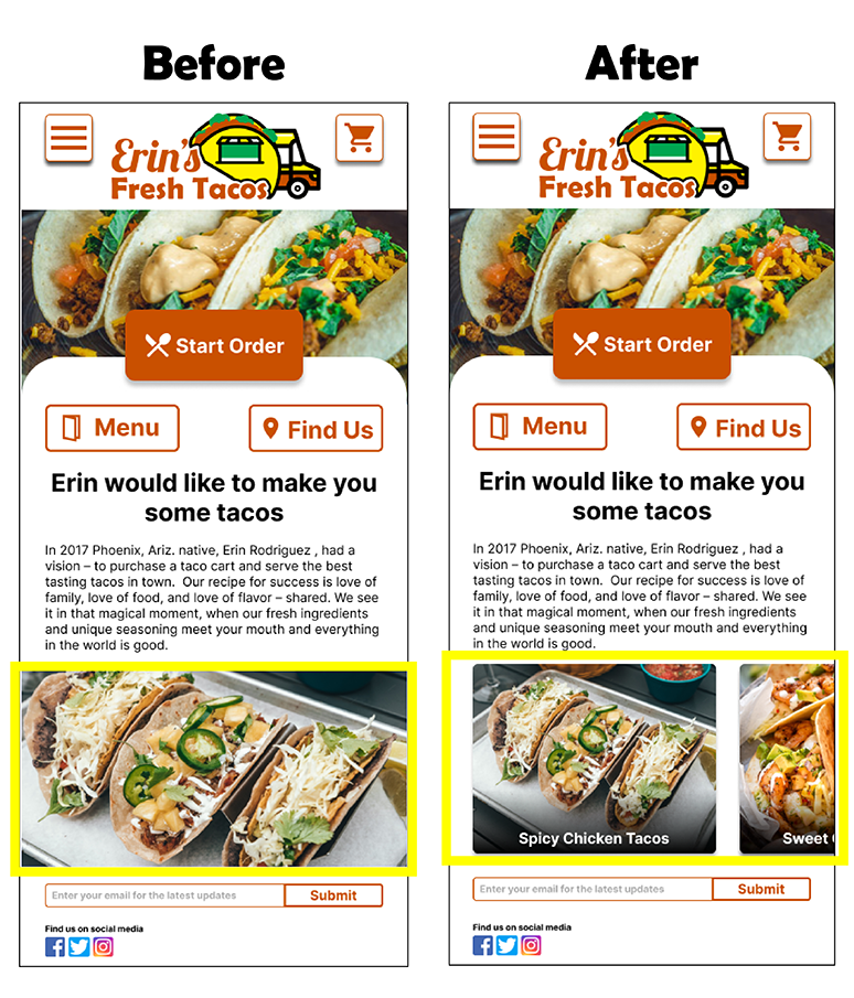
- One user suggested the ability to go right from the home screen to one of the food item page
Improvements
Improvements based on the usability study:
Low fidelity prototype to high fidelity prototype
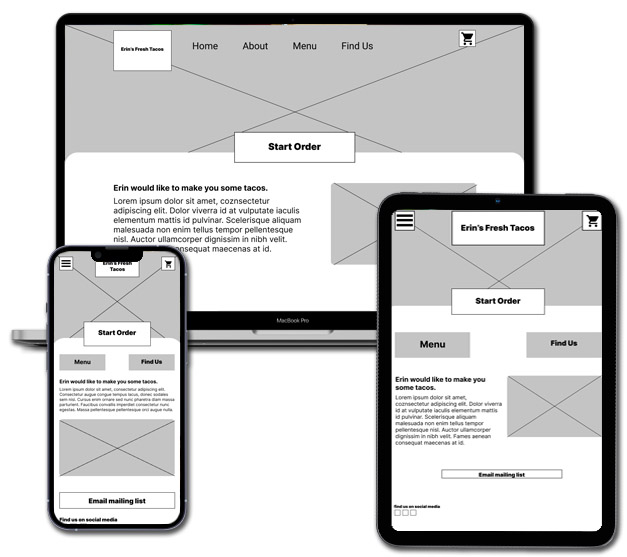
As I was moving from the low fidelity wireframe I wanted to create consistency with the design and branding no matter what device it was being viewed from. I also incorporated the user feedback I got during the usability study I conducted into high fidelity designs.
Improvements: Home screen
Some of the feedback I got from participants during the usability study was about allowing users to click on food items from the home screen. My goal was to enable to users to click on food items that take them to their pages but I didn’t want the home screen to be too cluttered. I decided using a horizontal scroll for the food items so they wouldn’t take up too much space from the original design but allow for users pick any good food they saw.
Improvements: Schedule order
I got a lot of great feedback for the usability study about how to schedule the user’s order. The participants wanted the scheduling menu at the top of the checkout page so I moved it up and I also added the place and time so they know the time they scheduled. I made sure that was reflected in the tablet and desktop versions.
Improvements: Find us
During the usability study participants wanted a way to interact with the map. So I create a interactive map for users to click on the stops so they can see the times and locations of the food truck.
A/B Testing
After completing the changes to the prototype from the usability testing I tested participants with A/B testing to see how the changes I made affected the way they interacted with the design. I used the speed as a Key Performance Indicator on how effective the changes have been.
Compared to the old prototype verses the new prototype participants were 20% faster getting through ordering process with the new design and they reported a higher satisfaction on using the website.
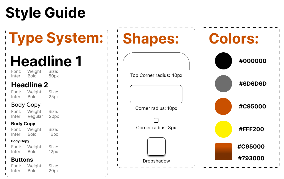
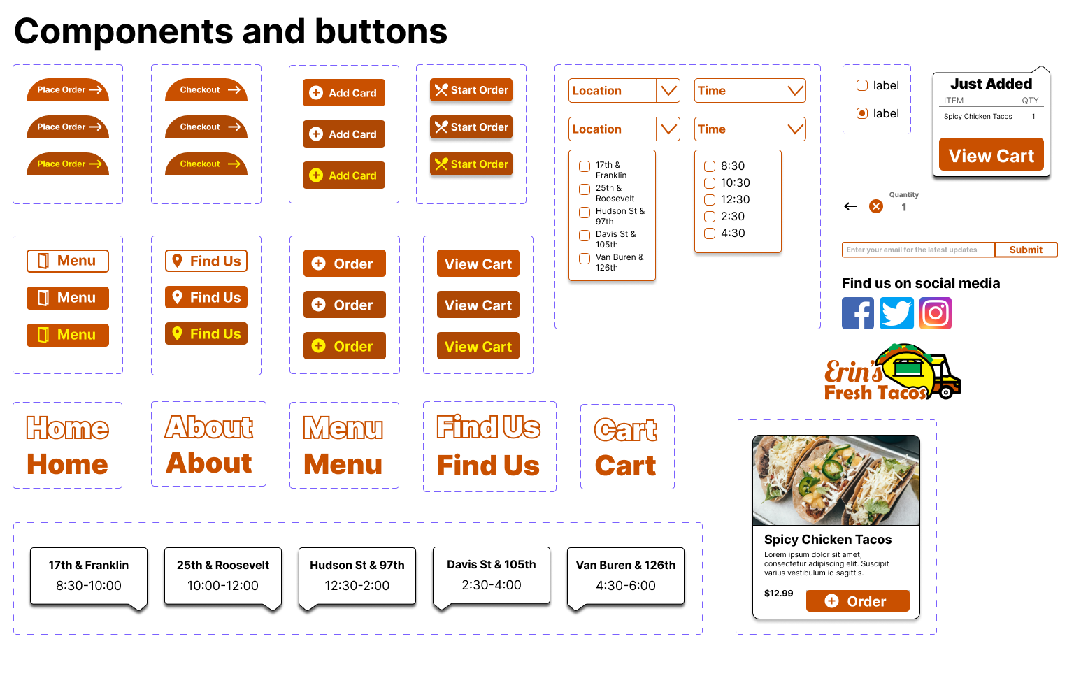
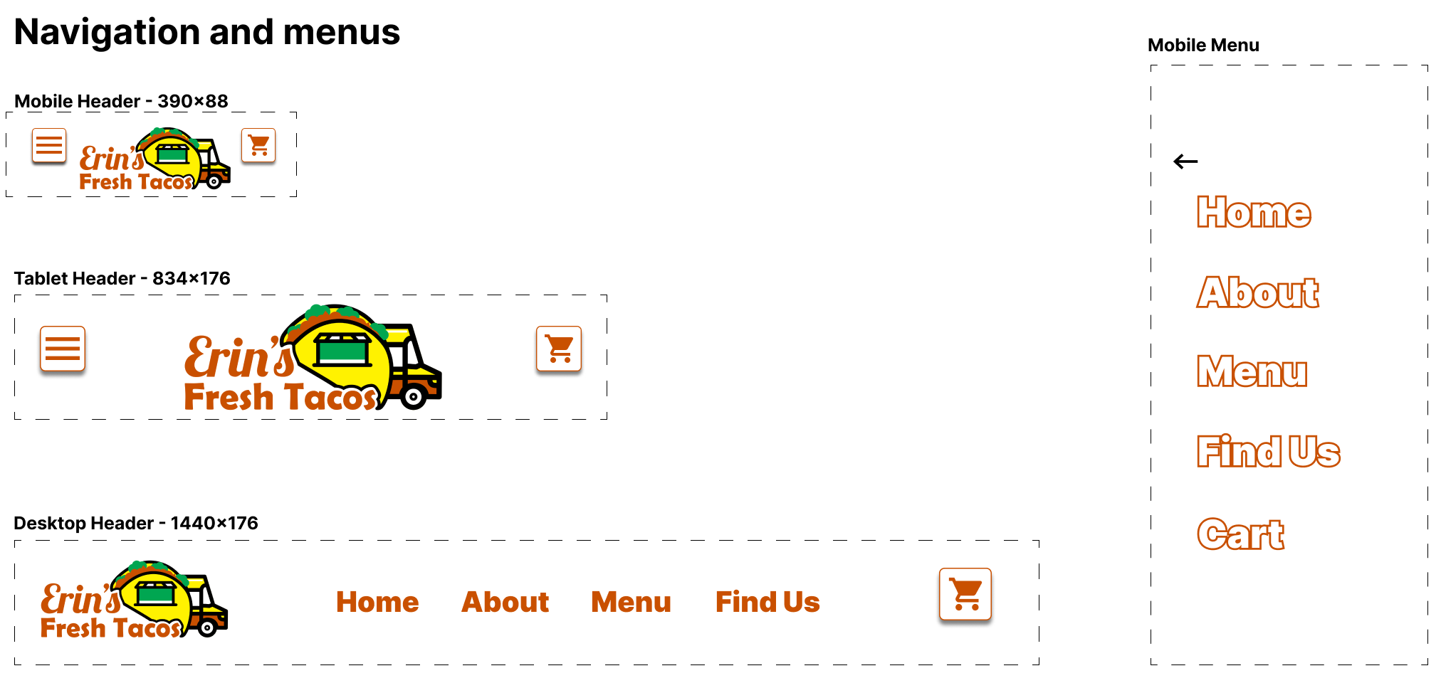
Design System
I wanted to implement a scalable and consistent design system that would allow the user to know they were at the taco truck website no matter what device they were on. I achieved that by:
- Pulling the colors from the logo and use it throughout the rest of the website for a more cohesive branding.
- Making components and buttons as flexible as possible. Also by keeping the roundness of corners consistent.
- Using the Inter typeface I wanted to make sure the text was legible regardless of device viewed on.
High Fidelity Prototype
When making the high-fidelity prototype I really wanted to incorporate all the feed back I got during the usability study.
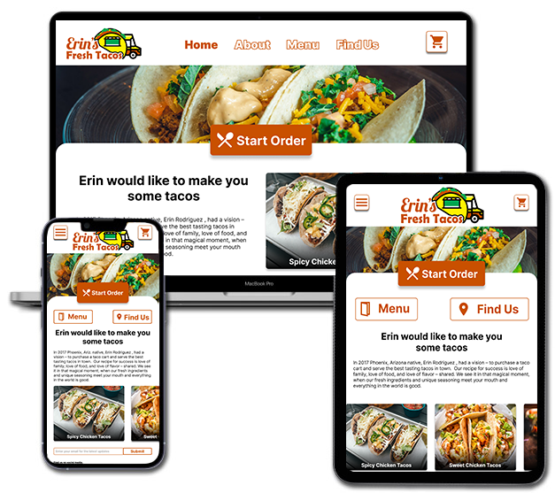
Interactive Figma Prototype
Takeaways and Impact
Deliverables:
● Engagement went up and customer drop off went down with customers using the website on mobile. Leading to an increase of 46% increase of online orders over a several month period.
● The owner was able to better meet demand at peak times better at locations as customers are now able to schedule their orders.
● The owner steadily received far less calls about their location as they informed customers they had a way to track the food truck’s route on the website.
What I learned:
I learned that when it comes to building an ordering flow it is good to create some redundancy on how users get to start their order so it gives them as many opportunities to start their purchase as they want. Also when having anything that has to be scheduled the menu for that needs to always be at the top of the design so users don’t even have to think about finding it.
Next Steps
I would do this moving forward:
- Do post-launch user testing and use something like Hotjar to see where I could further improve user flow by seeing how users interact with the product.
- Communicate with any stakeholders about making changes based on what their customers are staying about the website as well as the post-launch user testing.