Rental booking website
When I was creating QUVR I wanted to improve how people book vacation rentals. I wanted to create an experience that would make it easy for users to find the booking they wanted and then to smoothly go through the process to book the rental. I also wanted a home page that inspired users to book in places they may not have though about. I was tasked to design the website information architecture and the booking process to enhance the e-commerce experience.
I wanted to focus on the user and empathizes with them on what they needed when they were booking a listing. So I conducted user research to try and figure out what a user might need when booking a rental. During the whole design sprint I wanted to make sure the user was front and center whenever I made a change to the design.
Project Overview
My Role:
I lead the UX work and produced all major deliverables.
Responsibilities:
User research, ideation, UX design, wireframing, prototyping, visual design, branding, product design
Process:
I used the design thinking process in the development of this website:
User Research, Define, Ideation, Prototype, Test, and Implement
Problems and Goals
The Problems:
- There is some drop off with users engaging with the homepage.
- User research indicates that there could be improvements made for the booking process as it seems that users indicated a want to make it quicker.
- Users are struggling to find where to read multiple reviews on a listing page.
The Goals:
- Create a way for users to be exposed to listings as soon as they get on the homepage to increase engament.
- Better streamline the booking process and reduce the time for users to go through the process.
- Improve the listing page so there isn’t any confusion about where to find multiple reviews.
In this project, I was confronted with the task of designing an easy way for users to find the listing they want and also providing them an easy way to book it. I wanted to focus on an efficient online booking experience for users. What I expected was
User Research
Introduction:
I did a competitor analysis, user personas, user journey maps, and an user flow for my user research. I started my research with a competitor analysis and not only did I looked at other competitors in the rental booking market. After that I went into an user journey map and a user persona to really get a handle on who would be using the website to order and how they would book their rental.
Later in the process I conducted a usability study with potential users. After receiving their feedback I changed my designs to reflect a better user experience.
C&C Analysis
To determine the core features that customers might expect to be included in the website so I created a C&C analysis of the other rental companies. Here are some insights that I observed during my analysis:
- Encourage users to explore places they may not have though about visiting
- Many have a 1, 2, 3 approach to their checkout process
- Large photos of the properties is important to give users a better sense of what they will be booking
- There should be a very linear progression once a user decides to book a listing
User Persona
I found that when I used the insights gained from the competitor research I realized an user persona of a potential user. The user isn’t exactly sure the place she wants to go but once she does she wants the process to get her through the booking process needs to be smooth and quick.
User Journey Map
It was really important for me to get a handle on the user journey before starting on the user flow. I wanted to get in the head of the user and really empathize what kind of pain points they may come across when they go on their journey through the website.
User Flow: For Checkout
The goal of this user flow is to get the users to pick a listing and then guide them through the booking process. I wanted to focus a smooth transition from looking for listings to then the booking process.
Wireframes and Low Fidelity Prototyping
Paper Wireframe
As I was creating the paper wireframes for this project I was focusing allowing the user to discover other places they may like to stay at. I always try to be as open as possible at this stage so I can grab as many good idea from the different designs as possible.
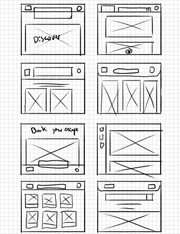
Digital Wireframe
My goal when transitioning from the paper to the digital was to put the focus on users to trying to decide on which place to book and then giving them a very simple linear progression through the process.
I didn’t want users to have to think much about the process of booking a rental. I wanted a seamless transition from the excitement of finding a rental to going through the checkout process to book it.

Usability Study
User Interviews
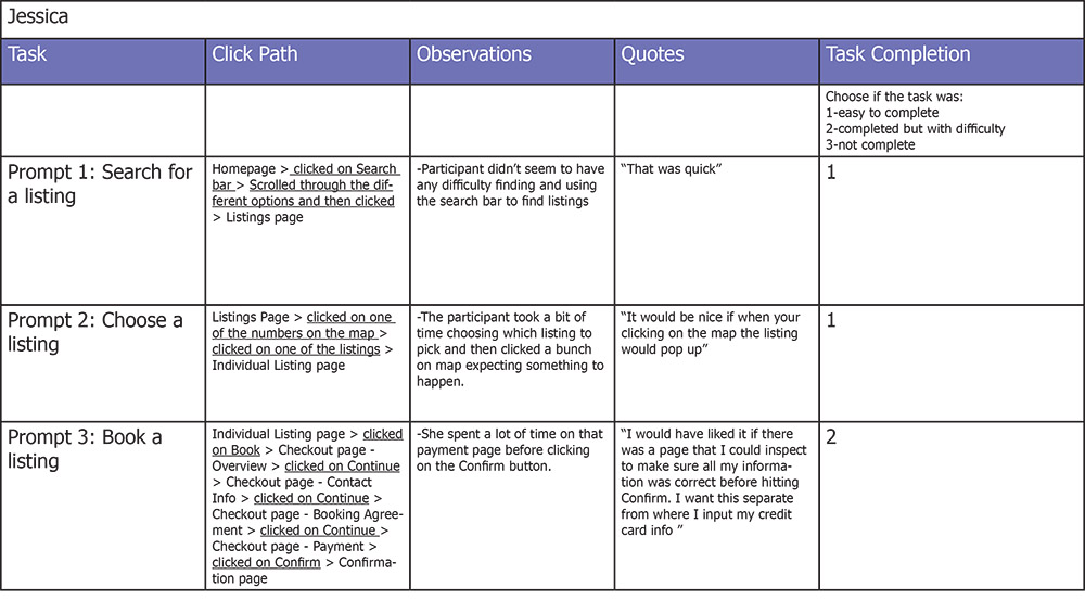
In order to better understand the goals and pain points while using the Low Fidelity Prototype, I conducted moderated interviews with several participants where I had them perform as set of tasks. Their ages ranged from 23-34 and included male and female participants. I assigned three simple tasks to each user: search for a listing, choose a listing, and book a listing.
Here is an example of some research on one of the participants interviews:
Affinity Diagram
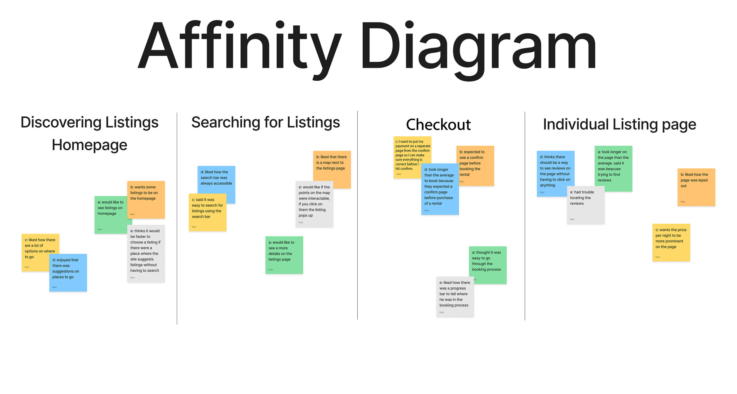
Insights
Through affinity mapping, the following themes/pain points emerged:
- Participants wanted to listings on the home page to help them decide where to book.
- Several of the participants wanted a confirmation page before they booked the listing.
- Participants would like to see reviews on a listing page without having to click on anything.
- One participants wanted the map on the listings page to be interactive and have listings pop up when you clicked on the numbers.
Improvements
Improvements based on the usability study
As I was moving from the low fidelity wireframe I wanted to create consistency with the design and branding. I also incorporated the user feedback I got during the usability study I conducted and incorporated them into the high fidelity designs.
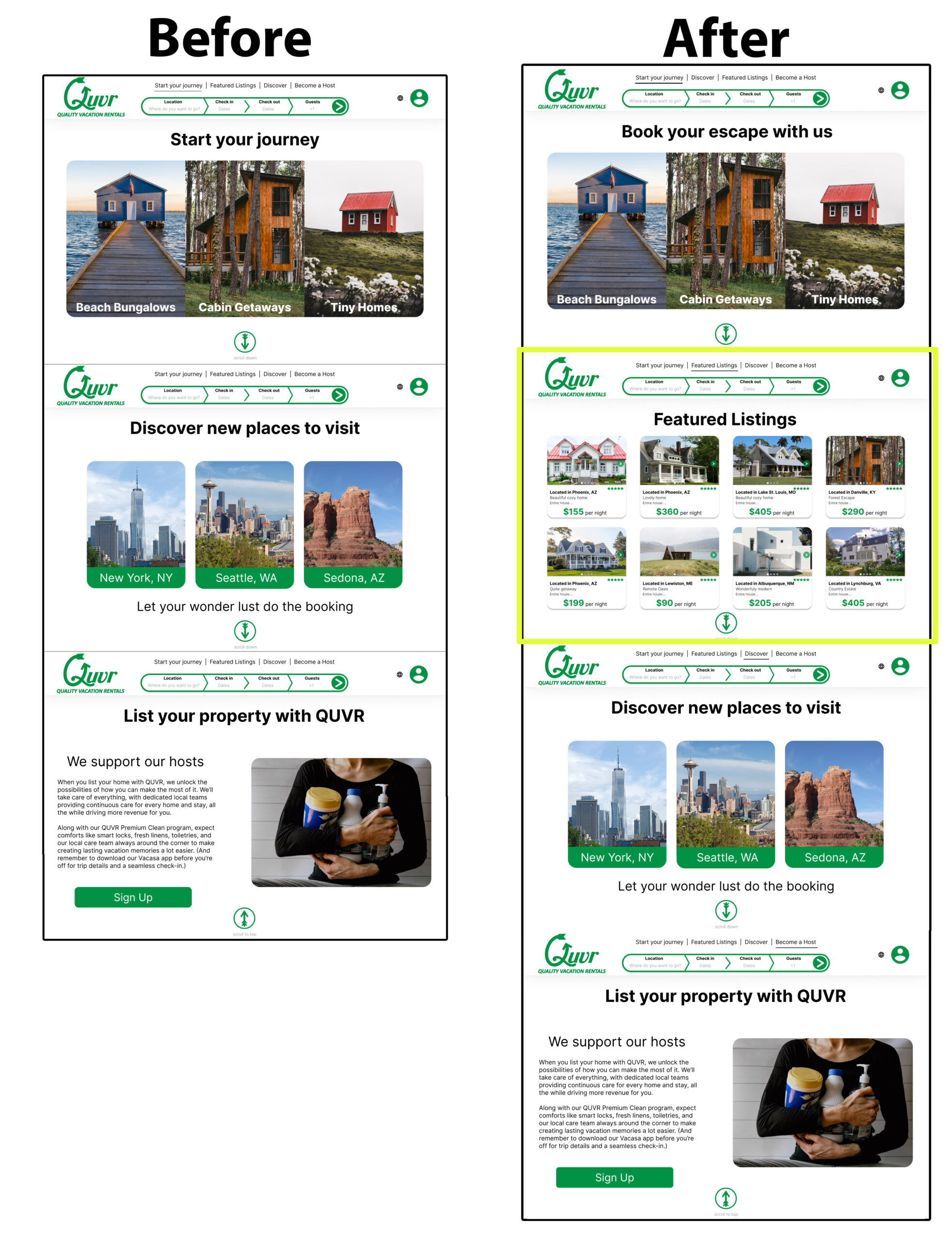
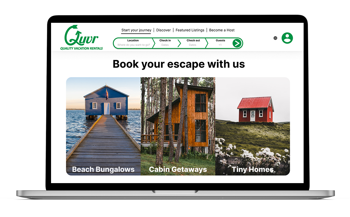
Improvements: Featured Listings
I noticed when I was conducting the usability study many of the participants were not engaging much with the home page. I also got feedback from participants that they would like to see listings on the homepage. My goal was to improve the discoverability of listings and increase engagement with the homepage.
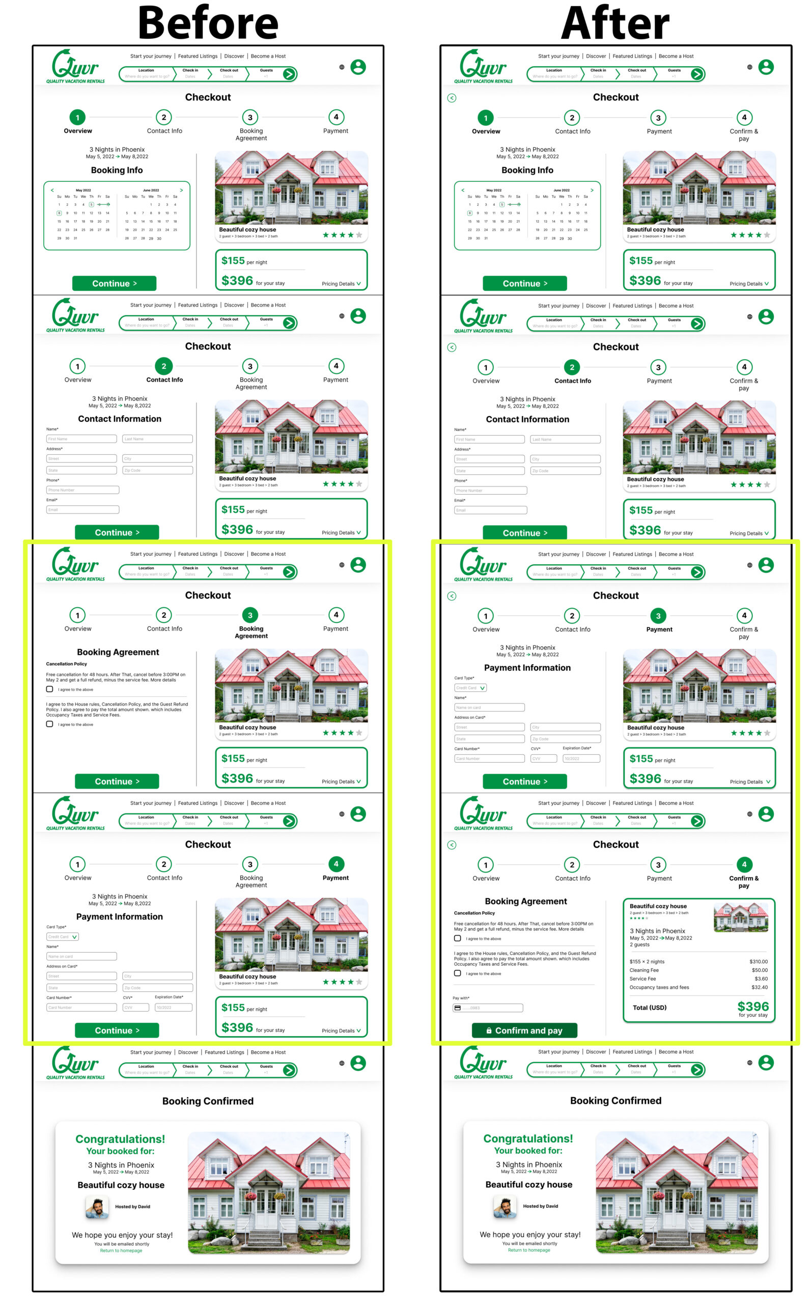
Improvements: Booking
There was a lot of feedback I got from participants about the Checkout flow. One of the biggest things that stuck out was they wanted Confirm page where they see a lot more information about their purchase before they paid. So I did that by combing the Booking Agreement page with the Confirm page.
I want to strive for a streamlined checkout process with no fewer four pages because I wanted to make sure the user has the lowest barrier as possible to getting a rental.
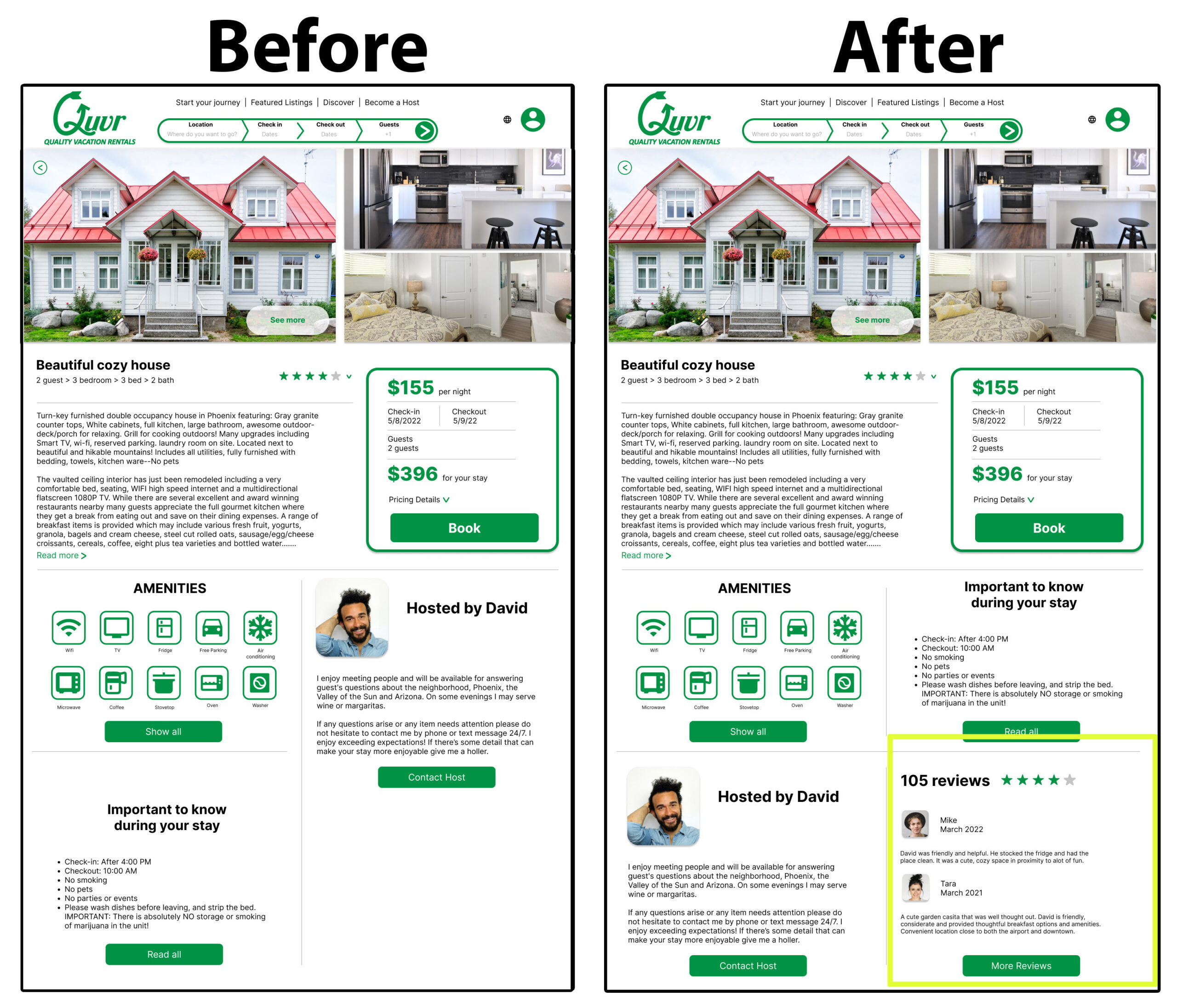
Improvements: Individual Listing Page – Reviews
One of the insights gained though my usability study was that participants wanted to be able to quickly read some of the reviews without having to click anything on the page. So I added several reviews to layout users can read and if they want to read more they can hit the More Reviews on the bottom.
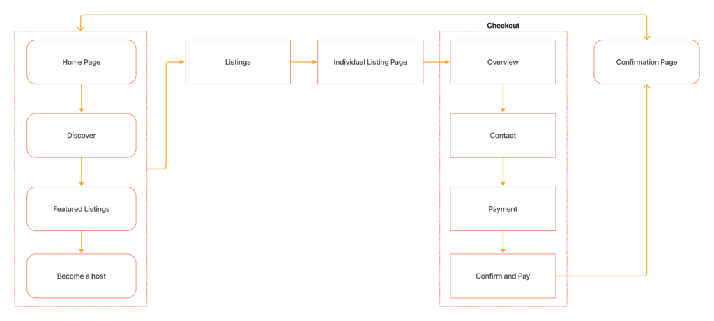
User Map
This is the updated user flow after I made changes based on the user feedback. I added the Featured Listings to the homepage and I changed around the checkout order.
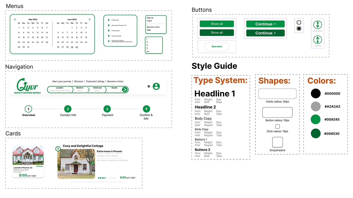
Design System
I wanted to implement a design system that was consistent as possible across the whole site. I achieved that by:
- Pulling the colors from the logo and use it throughout the rest of the website for a more cohesive branding.
- Making components and buttons as flexible as possible. Also by keeping the roundness of corners consistent.
- Using the Inter typeface I wanted to make sure the text was legible regardless of device viewed on.
High Fidelity Prototype and Second Usability Study
When making the high-fidelity prototype I really wanted to incorporate all the feed back I got during the usability study.
Interactive Figma Prototype
Second Usability Study
I conducted a second moderated usability study to test the changes I made in the high fidelity prototype verses the low fidelity prototype. I structured these as A/B tests and I was quantifying the time it took to complete each task and trying to measure the overall satisfaction of the user experience. Here are some of the insights I gained during the study:
- On average participants were overall 27% faster booking a rental with the updated prototype than the low fidelity prototype.
- When running participants through the improved checkout process their feedback was very positive and they were able to get through it 35% faster.
- Engagement increased by 42% with the home page by having listings there for users to click on.
- Not a single user drop off when prompting them to find multiple reviews.
Takeaways and Impact
Deliverables:
The user flow I designed and tested: increased user overall satisfaction with the website, lowered the drop off when users looked for booking reviews, and made the checkout process easier for them to go through. Through better engagement with customers I would expect to see an increase in revenue as it would be getting more bookings.
What I learned:
I learned that when it comes to building a booking system users what a detailed overview of everything before they hit confirm. Also users like have more information laid out on the page like some reviews so they don’t have to click or search for it on the page. Once a user makes a choice to purchase a product like a rental they don’t want to fight against the checkout process more than they have to.
Next Steps:
I would do this moving forward:
- The next step would be to gather the assets, make sure everything is properly annotated, and prepare it for the engineers to start working on it.
- If I had more time and I would:
- create a mobile app version as well
- design a back end for the hosts
- make an on-boarding process for users to sign up
- Do post-launch user testing and use something like Hotjar to see where I could further improve user flow by seeing how users interact with the product.
- Communicate with any stakeholders about making changes based on what their customers are staying about the website as well as the post-launch user testing.